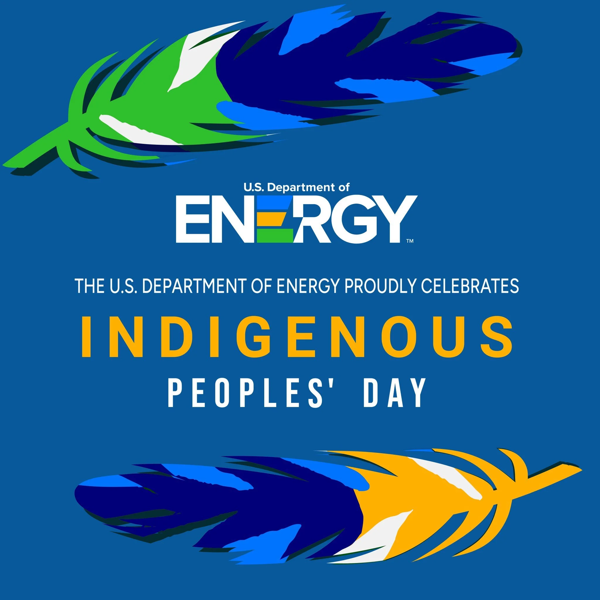
REBRANDING THE U.S. DEPARTMENT OF ENERGY
A New Look For a Bright Future
Designing for past, present, & future.
Rebranding a federal government agency with a history and mission as complex as the U.S. Department of Energy’s is no small feat. Our challenge was to build on the Department’s legacy and create a modern brand identity that could propel the agency into the decades ahead and better serve the American people.
Here’s how we did it.
PART ONE | Understanding the Legacy
Founded in 1977 by President Jimmy Carter, the U.S. Department of Energy was built on the legacy of the Manhattan Project and the U.S. Atomic Energy Commission. This history laid the foundation for the Department’s broad mission areas: maintaining the nation’s nuclear stockpile; managing environmental and legacy clean-up sites; leading the world in scientific innovation; and advancing America’s energy sector.
The Department’s seal was personally created by the first Secretary of Energy, James R. Schlesinger — and his design became the agency’s driving brand identity for nearly 50 years. “DOE Green” and “DOE Gold” made up its primary colors, with a deep navy blue gradient incorporated into the seal, and the seal utilized iconography such as a bolt of electricity, a bald eagle, and examples of energy technology.

In this photo: The first U.S. Secretary of Energy James Schlesinger unveils a sign at the U.S. Department of Energy.
Over the decades, these design elements shaped thousands upon thousands of public-facing campaigns and initiatives, and drove countless sub-brands and co-brands amongst the Department’s offices, semi-independent organizations, and external partners. And given the breadth of the work undertaken by the agency and the scores of offices supporting those efforts, how this visual identity was applied varied widely.
PART TWO | Modernizing the Brand
Rather than run from the visual identity that had defined the U.S. Department of Energy since its founding, we decided to embrace it.
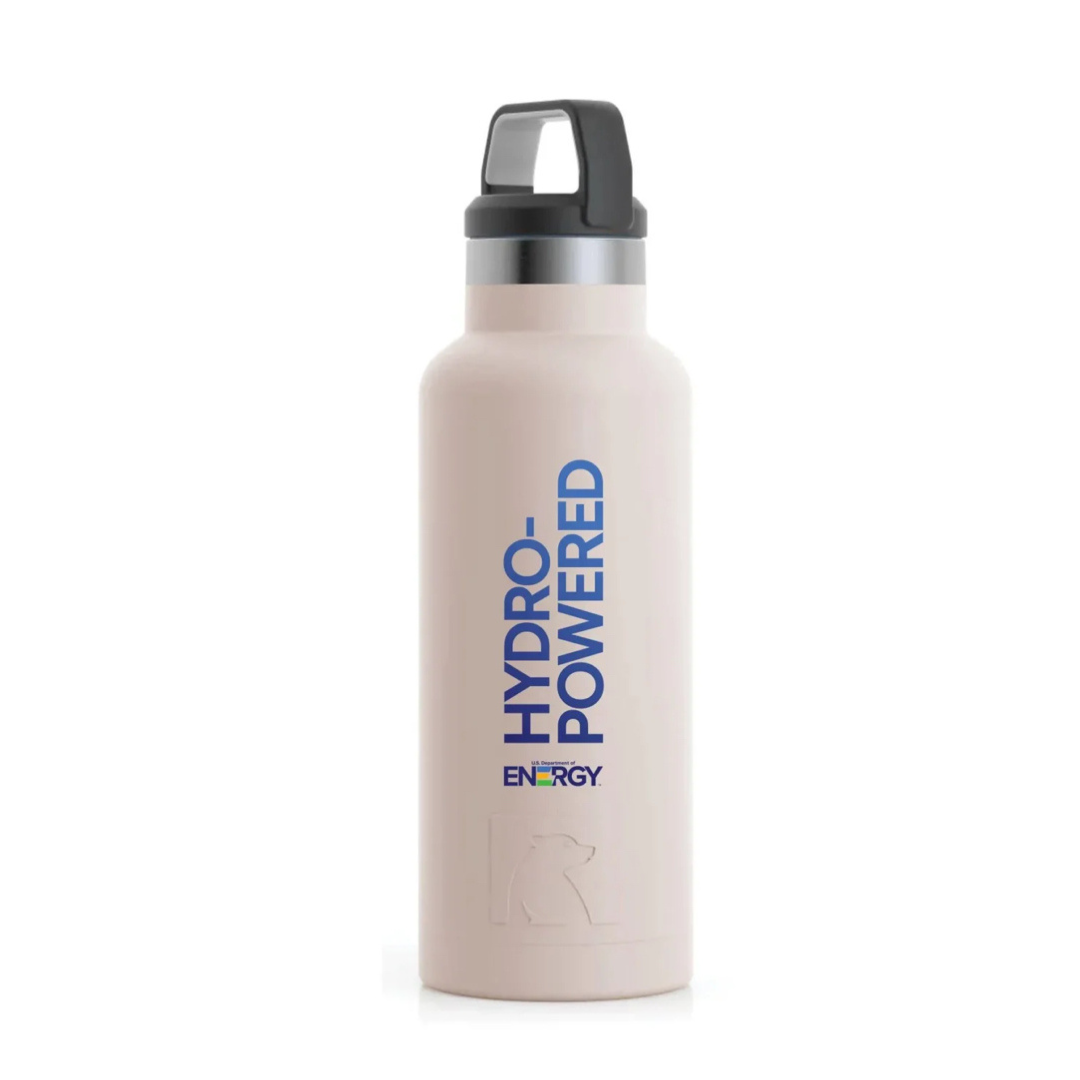
In creating the Department’s first-ever freestanding logo, we looked to the original colors of the agency’s seal and reimagined them into punchier, more eye-catching versions.

These colors allowed us to create something that was both familiar and new at the same time.
To help offices utilize these new hues effectively, we created a comprehensive brand guide that laid out not only the primary and secondary colors, but also:
When and how they should be used;
In what ratios they should be used together; and
What combinations would and wouldn’t meet color contrast accessibility requirements.
In addition to the colors, we also wanted to pull visual inspiration from the seal while still creating something clean and modern, that could be used effectively across print, video, and digital mediums. We needed this iconography to be something that could represent the full breadth of the Department’s work — from national security and legacy management, to scientific research and more literal “energy” technology and deployment — and that wouldn’t be overly tied to any one technology or energy type.
Thankfully, Secretary Schlesinger gave us something in his original design that accomplished just that: the lightning bolt. At its most literal, the bolt can represent electricity and energy in the world around us. As a more representational symbol, it can represent the spark of innovation that has driven the Department since its inception, and the power of its national security mission.

By incorporating the bolt into the whitespace of the Department’s new logo and logo mark, we embraced a symbol that was meaningful, recognizable, and relevant to fifty years of history and everything that lies ahead.
WATCH: “A NEW LOGO FOR A BRIGHT FUTURE”
PART THREE | From Concept to Practice
Once the visual identity and brand was established, we set about building this new creative world for the Department. This involved developing a comprehensive brand style guide that would empower the Department’s 70+ offices to adopt and utilize the new brand, creating training opportunities for staff and in-house designers, and establishing new internal workflows to better support agency-wide brand management.